Pin Charts and Ask Follow-Up Questions: Deep-Dive Analysis with Nahla AI
Lock any chart as a visual anchor, then ask natural language questions about its data. Build comprehensive analysis narratives without ever losing context.
Feature GuideFebruary 27, 2026| 8 min read|By Nahla Team
Lock any chart as a visual anchor, then ask natural language questions about its data. Build comprehensive analysis narratives without ever losing context.
The Problem: Charts in Isolation
Traditional project analysis tools treat every chart as a dead end. You generate an S-curve, spot an anomaly in March where actual costs spike above the baseline, and then... you are on your own. To investigate, you switch to a different view, run a new filter, pull up a separate table. By the time you find the answer, you have lost the visual context that prompted the question in the first place.
This constant context-switching wastes time and breaks analytical flow. Project controls professionals spend more time navigating between screens than actually analyzing data. Monthly reporting becomes a tedious exercise of screenshot, switch, query, screenshot, switch, query — repeated across dozens of charts.
What if you could just point at a chart and ask "Why?"
That is exactly what Pin Chart + Drill-Down Chat delivers. It turns every chart on the Analysis page into an interactive conversation starter, with AI that has full access to the chart's underlying data.
How It Works
The workflow is simple: generate a chart, pin it, and start asking questions. The AI sees everything the chart sees — every data point, every task, every metric — so its answers are grounded in your actual project data, not generic advice.
Here is the full workflow, step by step.
Step 1
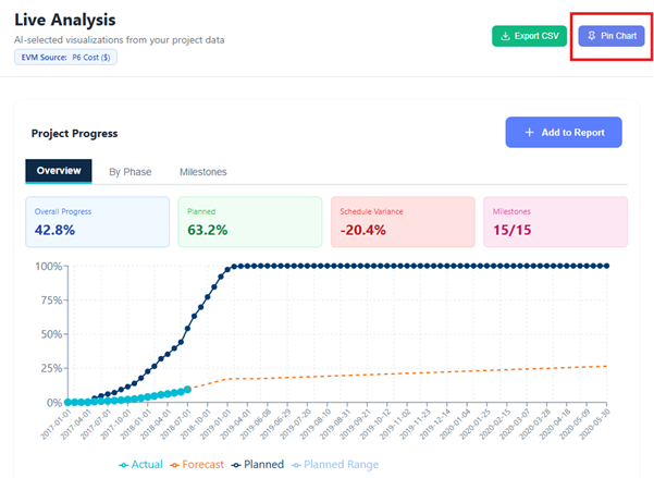
Generate a Chart
Start by asking Nahla any analytical question on the Analysis page. Type a natural language query like the examples below:
"Show me the S-curve"
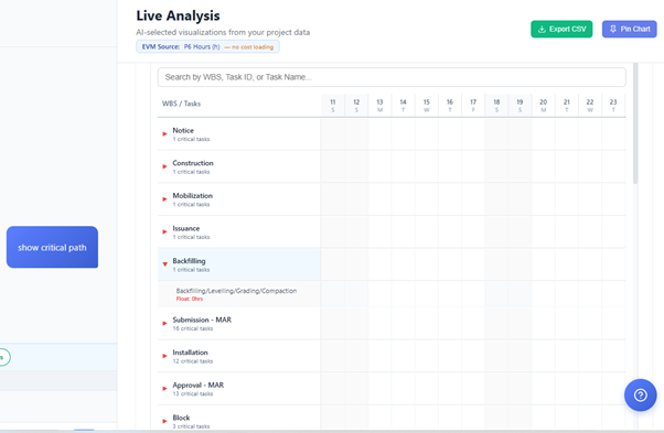
"Show critical path analysis"
Nahla processes your query against the uploaded schedule data and returns a chart visualization along with supporting metrics.
Step 2
Pin the Chart
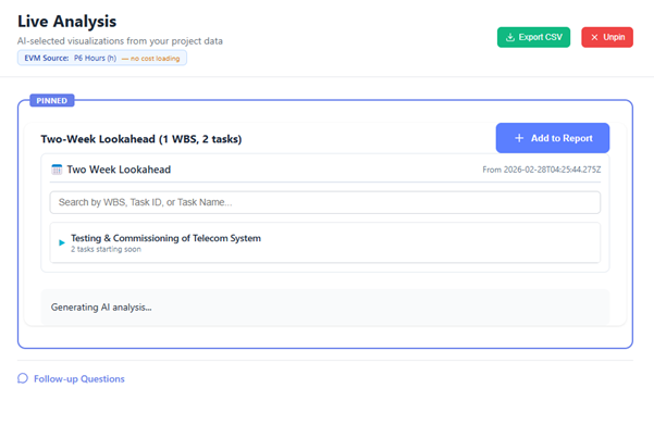
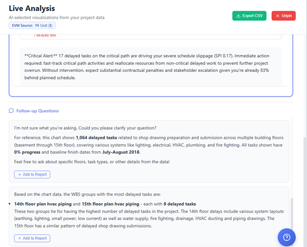
See something interesting? Click the pin icon on the chart. The chart immediately moves to the top of the page and locks in place as a visual anchor. A dedicated drill-down input field appears below it, inviting you to ask follow-up questions.
The rest of the Analysis page remains accessible below, but your pinned chart stays fixed at the top so you never lose sight of what you are investigating.
Step 3
Ask Follow-Up Questions
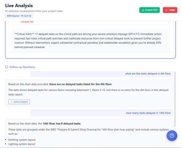
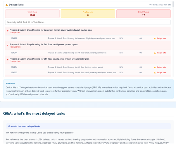
With a chart pinned, type any question about its data into the drill-down input. The AI has the complete dataset behind the chart as context, so it can give precise, data-55backed answers.
Try questions like:
"Why did actual costs spike in March?"
"Which WBS elements are driving the cost variance?"
"What would happen if we recovered 5% efficiency?"
"Show me the tasks that caused the SPI drop"
e AI responds with analysis tied directly to the numbers in your pinned chart — not generic project management advice, but answers drawn from your actual schedule data.
Step 4
Build Your Analysis
Each question-and-answer pair accumulates below the pinned chart, forming a conversation thread. Ask 5, 10, or 20 questions — the thread grows into a comprehensive analysis narrative anchored to a single visualization.
This is where the feature truly shines. Instead of scattered notes and screenshots, you build a structured, data-driven investigation in one place. Each answer builds on the last, letting you drill progressively deeper into root causes.
SCREENSHOT:
Step 5
Add to Report
When you are ready to share your findings, include the pinned chart and its entire Q&A conversation in your generated report. Stakeholders see both the visualization and the AI-powered analysis — the chart tells the story at a glance, and the drill-down thread explains the details.
No more assembling reports from disconnected screenshots and manually written commentary. The chart and analysis are a single, cohesive unit.
To release the chart and return to normal analysis mode, simply click the pin icon again. The chart unpins, the drill-down input disappears, and you are back to free-form querying.
Real-World Examples
Here are three common scenarios where Pin + Drill-Down transforms how project controls professionals work with their data.
Example 1: Investigating Cost Performance
1. Generate the S-Curve and pin it
2. "Why is CPI declining over the last three months?"
3. "Which activities are over budget?"
4. "What is the forecast if we correct these three activities?"
5. Add the chart + full Q&A thread to the monthly cost report
Example 2: Assessing Schedule Risk
1. Generate the Risk Heatmap and pin it
2. "Which high-risk tasks are on the critical path?"
3. "What mitigation actions do you recommend for the top 5 risks?"
4. "How much float do these tasks have?"
5. Add to the risk assessment section of the project report
Example 3: WBS Progress Deep-Dive
1. Generate WBS Progress breakdown and pin it
2. "Which WBS level 2 elements are behind schedule?"
3. "Show me the delayed tasks in Civil Works"
4. "What is causing the delay in foundation activities?"
5. Include as the progress section of the executive summary
Tips for Effective Drill-Down Analysis
Start Broad, Then Narrow
Begin with a high-level query like "Show overall project health." Pin the result, then drill in: "What is driving the delay?" followed by "Show me the specific tasks." Each question sharpens your focus.
Compare Data Sources
Pin an S-curve generated from schedule data and ask questions. Then unpin, regenerate with CSV actual cost data, and pin again. Compare the AI's answers across both sources to identify discrepancies.
Build Executive Summaries
Pin each key chart and ask the AI to "summarize this in plain language for a non-technical stakeholder." The accumulated Q&A thread becomes a ready-made executive briefing when added to a report.
Streamline Monthly Reporting
For each section of your monthly report, pin the relevant chart and ask the AI to highlight changes since last period, flag concerns, and recommend actions. Export each section directly into the report.
Pro tip: The AI's answers improve when you ask specific, quantitative questions. Instead of "Is this good?", try "What is the CPI trend over the last 4 months, and which WBS elements have CPI below 0.9?" The more precise your question, the more actionable the answer.
Try Pin + Drill-Down Today
Upload a Primavera P6 (.XER) or MS Project schedule, navigate to the Analysis page, and pin your first chart. Your project data is waiting to answer your questions.
© 2026 Nahla AI — Intelligent Project Controls
Try Nahla AI Today
Upload your Primavera P6 .XER file and get instant project analytics.
Get Started Free